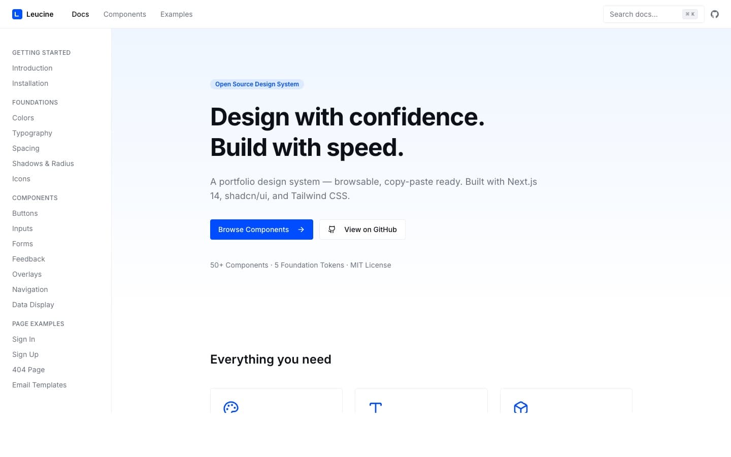
The design system that replaced Figma.
One unified system across 4 enterprise pharma products. I built it in 5 days, designing in code with Claude Code. The handoff loop disappeared, the design team consolidated from 5 to 1, and a new product's MVP frontend now ships in 4 days — not weeks.
ROLE
Head of Design
TIMELINE
5 days (Aug 2025)
TEAM
1 designer + 3 engineers
SCOPE
Design Systems, AI Methodology
Leucine is a digital twin of the pharma manufacturing shop floor — an AI-powered, FDA-regulated compliance platform, Series A backed by Ecolab, deployed across 300+ facilities in 10 countries. Four products: MES (Manufacturing Execution), CLEEN (Cleaning Validation), Leucine OS (Quality Management), and FDA Tracker (Compliance Intelligence).
I joined in 2020 as the second designer and grew over six years from IC to Design Lead managing five designers to Head of Design. In August 2025 I rebuilt how all four products get designed: one system, in code, in five days.
Scope, stated plainly: I built the system solo; three frontend engineers handled integration across the four product codebases.
Industry
Regulated pharma manufacturing
FDA-regulated compliance, Series A, backed by Ecolab.
Footprint
300+ facilities, 10 countries
50+ companies running the platform in production.
Products
MES · CLEEN · OS · FDA Tracker
Four enterprise products, one design language.
Tenure
6 years (2020 → 2026)
Second designer → Head of Design.
Two component libraries. Every screen built twice.
DWI/MES was built on Material UI. CLEEN was built on Ant Design — two products from the same company that looked like they came from different companies. Every new component was built from scratch, twice; every design update was double the work. A customer using both CLEEN and MES experienced two different-looking products from one vendor.
Five designers, forty engineers. The bottleneck wasn't talent — it was the gap between Figma and code. Every design decision lost fidelity in translation.
The handoff loop
PM writes spec → Designer opens Figma → Handoff to engineer → Engineer interprets → 3–5 rounds of review → “close enough” ships
The problem wasn't the libraries. It was that the design lived somewhere the code couldn't read.
The obvious read was a visual-consistency problem: two libraries, two look-and-feels, unify them. That's the symptom. The actual gap was structural — the design existed as Figma artifacts engineers had to interpret into code, and every interpretation leaked fidelity. Five designers spent most of their time on handoff, review, and rework instead of user problems. The brand inconsistency was unsolvable inside that architecture, because the architecture itself was the inefficiency: a translation layer between intent and implementation.
So the decision wasn't “pick a better library.” It was: remove the translation layer entirely. Ditch Figma, ditch both libraries, build one system in code that engineers — and an AI — can read and build from directly. I evaluated five libraries on three questions most design leaders weren't asking:
Visual control
No opinions to fight
MUI/Ant fight you when you deeply customise. shadcn is headless primitives + Tailwind — full control.
No dependency hell
No shared npm dep
npm packages mean version conflicts across 4 codebases on different release cycles. shadcn copy-paste lives in each repo.
AI-readable
Plain React + Tailwind
Claude Code reads plain React + Tailwind. Proprietary theming APIs (sx prop, ConfigProvider) are barriers to AI composition.
Library
Visual control
No dep hell
AI-readable
MUI v5
✗
✗
✗
Chakra UI
✓
✗
△
Mantine
△
✗
△
Ant Design v5
✗
✗
✗
shadcn/ui
✓
✓
✓
The third criterion — AI-readability — is what almost no design leader was asking for in 2025. shadcn's plain React + Tailwind structure meant the design system could become a Claude Code skill file: a set of instructions an AI could read and build from.
One unified design system. Tokens, components, blocks, and a skill file.
Foundations — accessibility baked in, not audited after.
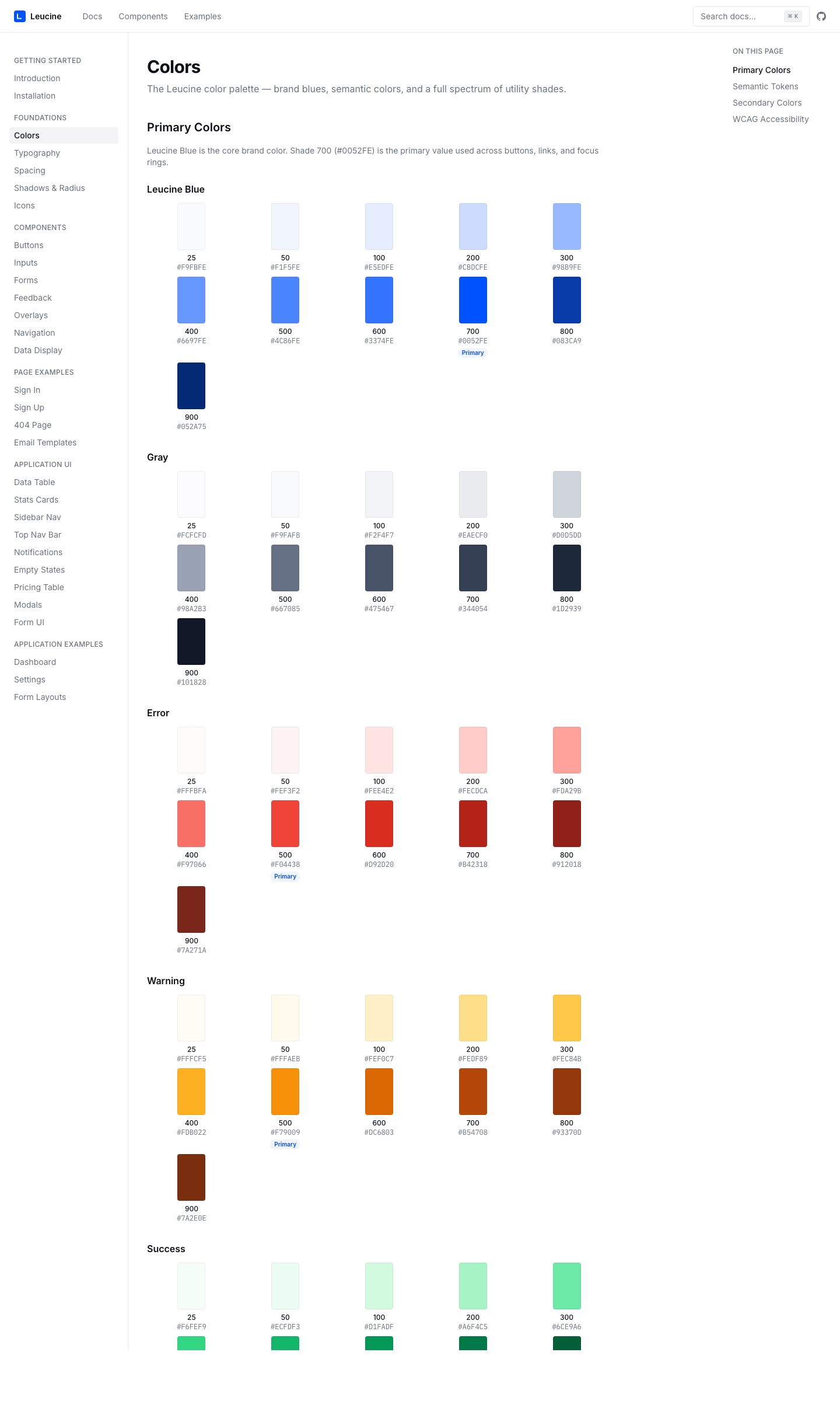
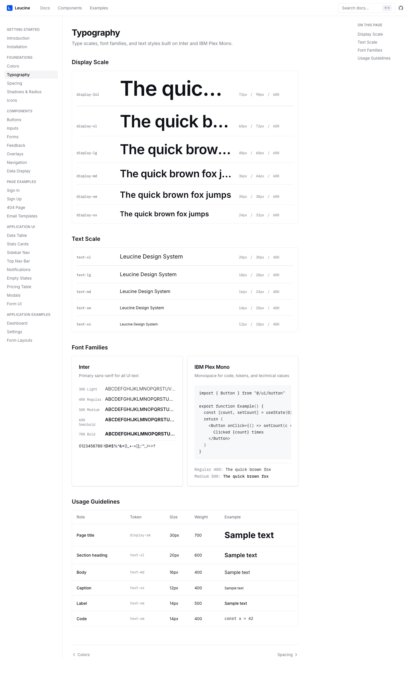
14 colour palettes with 11 shades each. Inter + IBM Plex Mono. WCAG contrast compliance built into the foundation at token level — so it can't be violated downstream.
Components — engineers grab the code directly.
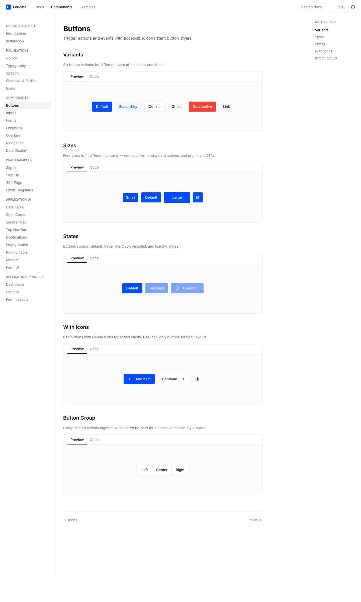
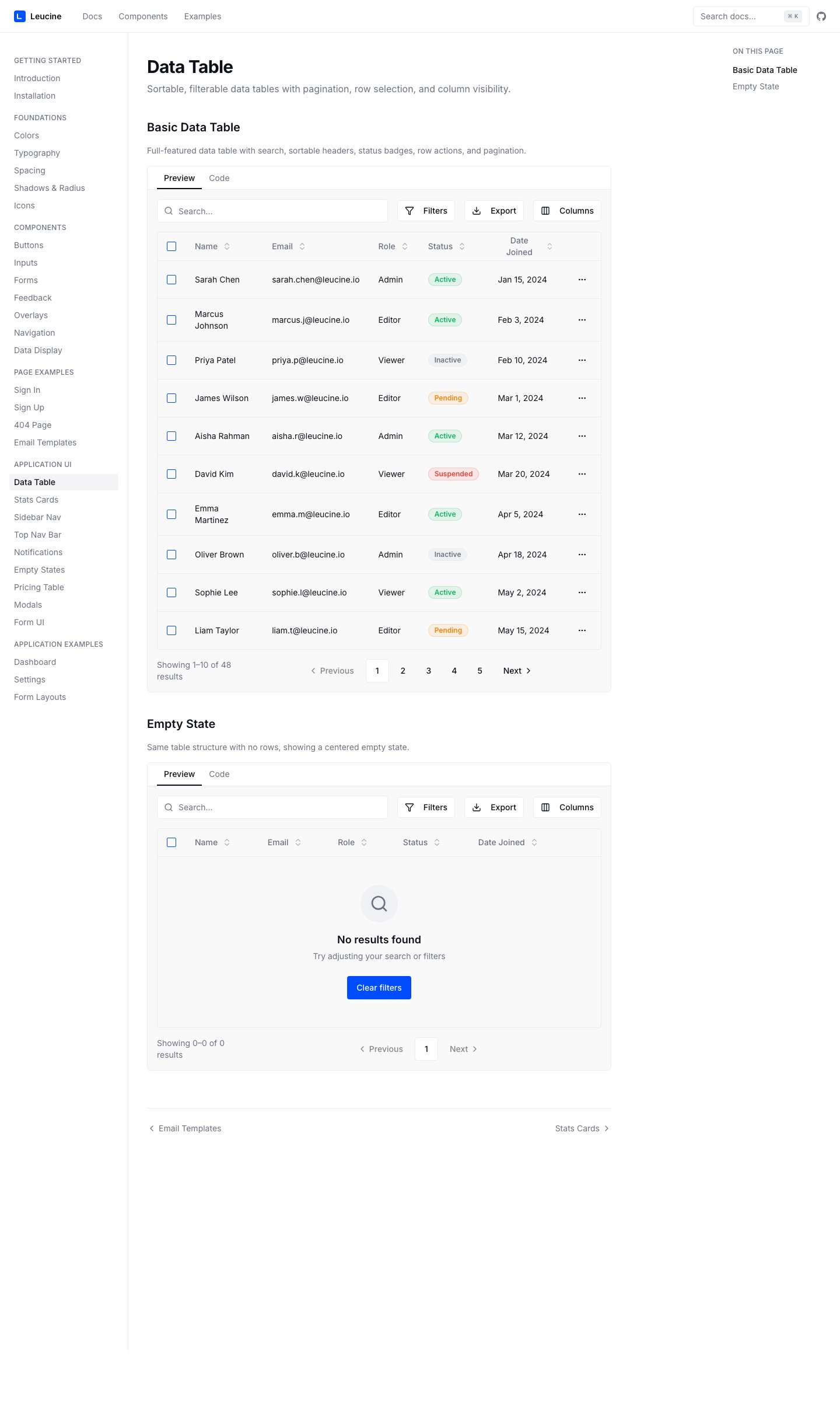
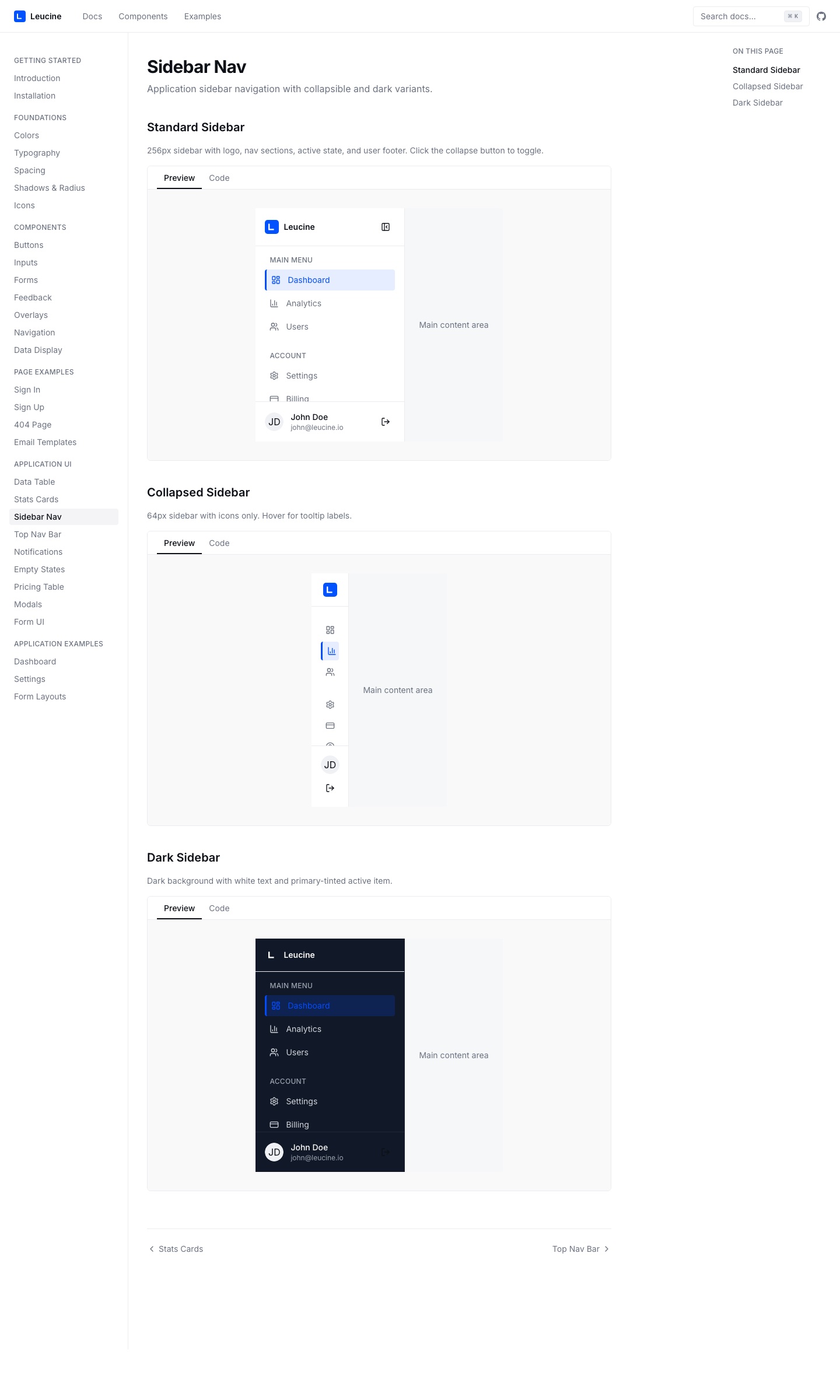
46 shadcn primitives + 16 custom components. Live preview and a code tab on every component. Engineers copy the code directly — no copy-paste from Figma-plugin output.
Blocks — the decisions, pre-composed.
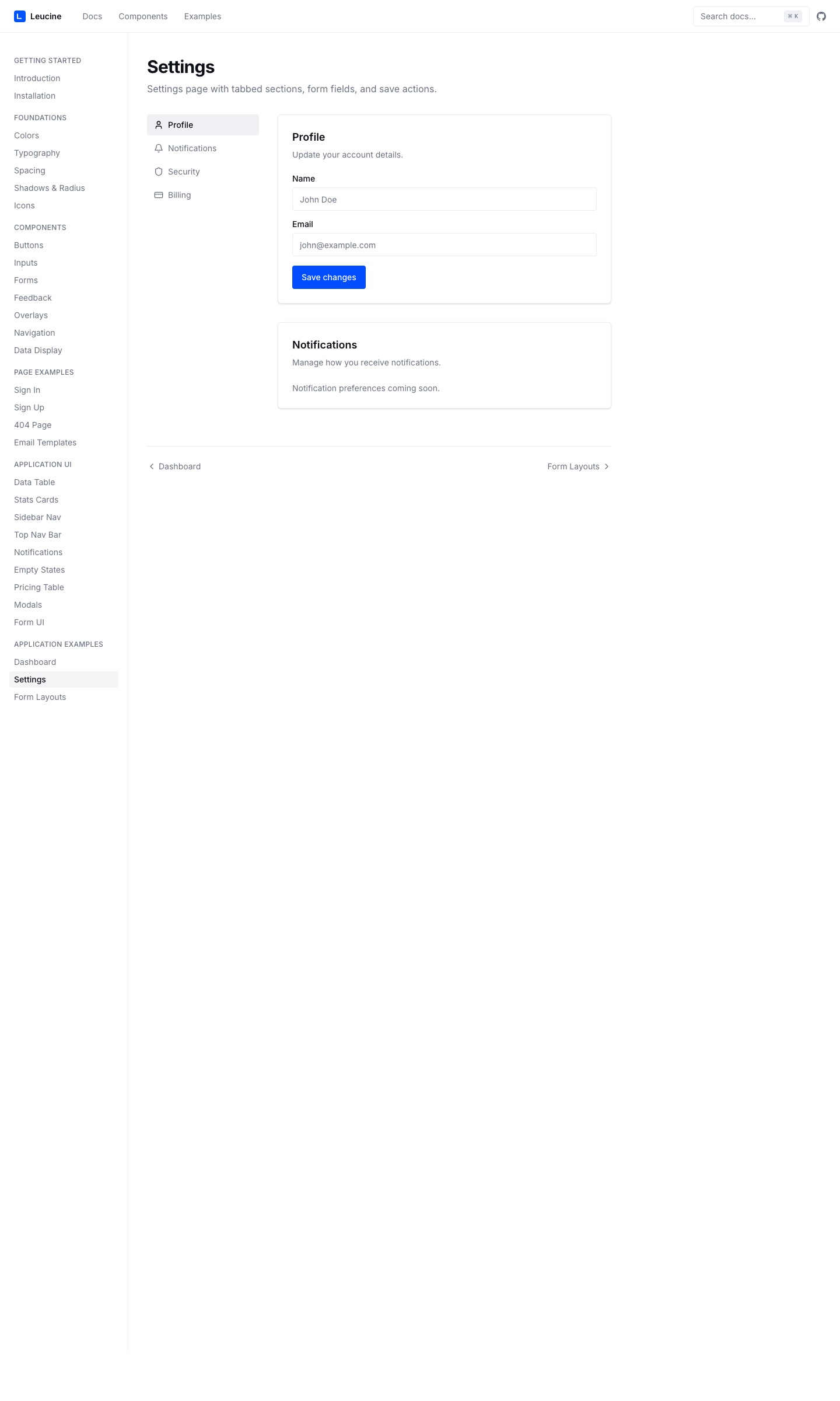
Not primitives — pre-composed blocks for login, forms, dashboards, and data tables. Engineers and PMs don't think at the system level, so the blocks carry the decisions for them.
The skill file — the design system became the designer.
The system is encoded as Claude Code instructions. An engineer describes a requirement; Claude reads the system — tokens, components, blocks — and builds a branded, accessible page that follows every design decision I made, without me in the room.
Claude Code skill file
# Leucine Design System Skill

## Tokens
  primary:  #0052FE
  surface:  14 palettes × 11 shades
  type:     Inter + IBM Plex Mono
  spacing:  4 / 8 / 12 / 16 / 24 / 32

## Components
  46 shadcn primitives
  16 custom (sidebar, topbar, ...)

## Blocks
  login · signup · dashboard
  data-table · form · settings

## Accessibility
  WCAG AA contrast · focus rings
  semantic HTML · ARIA labels
→ reading skill file...→ composing with shadcn primitives + Settings block✓ Generated using Leucine DS tokensThey don't open Figma and they don't wait for a designer. They open Claude Code, describe the page, and the skill file builds it with the correct tokens, components, and blocks — branded, consistent, accessible.
A 5-day build, because six years told me exactly what to build.
The calendar was realistic only because I knew exactly what to build. Six years inside the failure modes — handoff fidelity loss, double-build overhead, brand drift — meant I'd already designed the system mentally. The five days were execution, not discovery.
DAY 1 · FOUNDATIONS
Evaluated libraries → shadcn/ui. Next.js docs site. Leucine Blue (#0052FE), 14 palettes × 11 shades. Inter + IBM Plex Mono, 11 type scales. WCAG AA contrast baked in.
DAY 2 · COMPONENT PRIMITIVES
46 shadcn components installed + themed. ComponentPreview with live preview + code tab. Started 16 custom components (sidebar, topbar, swatches).
DAY 3 · APPLICATION BLOCKS
Login + signup flows. Data tables, stats cards, sidebar nav. Empty states, pricing pages, modal patterns.
DAY 4 · DOCUMENTATION
31 documentation pages — Getting Started, Foundations, Components, App UI, Examples. Live preview on every page.
DAY 5 · INTEGRATION + SKILL FILE
Integration with 3 frontend engineers. Dark theme via next-themes; final token propagation. The Claude Code skill file written — the design system as AI instructions.
The decisions a Figma-first design leader wouldn't have made:
Decision
What it reveals about how Janam thinks
Evaluated libraries on AI-readability, not docs or community size.
Designs for where the workflow is going, not where it is. In 2025, 'can an AI read and build from this?' was a criterion almost no design leader was applying.
Chose copy-paste shadcn over npm component packages.
Thinks like an engineer about dependency risk. Four products on different release cycles sharing one npm dep is a version-conflict trap; copy-paste removes the shared failure point.
Shipped blocks, not just primitives.
Knows the consumer isn't a designer. Engineers and PMs shouldn't make system-level decisions, so the blocks carry the decisions for them.
Encoded the system as a Claude Code skill file.
Treats the design system as a program, not a reference. A static library describes components; a skill file executes them. The system becomes the designer.
WCAG contrast baked into the foundation, not audited after.
Builds the constraint in at token level so it can't be violated downstream — accessibility as architecture, not QA.
Dark theme via token swap, propagated in one PR across 4 products.
Designs the token layer so a single change cascades everywhere. The leverage is in the system structure, not per-screen effort.
Engineers compose pages directly from the skill file.
Three frontend engineers worked alongside me on integration. Initial pushback — they liked Figma artifacts as visual specs. The breakthrough: composing a settings page from the skill file in 10 minutes, where the same page had taken three days through handoff. I now review at system level (token changes, new block patterns), not page level (button placement, copy). Course-corrections compound.
The designer-as-bottleneck step disappeared.
The new flow: PM writes a requirement → engineer opens Claude Code → Claude reads the skill file → page built with tokens and blocks → review and ship. The system runs across four products and 300+ pharma facilities, and the brand inconsistency that had persisted since 2020 is gone.
5 → 1, honestly.The design team went from five to one — me. Three found higher-leverage roles inside Leucine (one to product management, two to demand generation), one left for an unrelated opportunity, and one role — producing static mockups for engineers to interpret — was eliminated because that step no longer existed. The system didn't replace people; it replaced the translation step that was consuming their time. Most of the team moved up into higher-leverage work.
One design system. Four products. 300+ facilities. 40+ engineers. And one designer operating at the leverage of five — because the system carries the decisions.