Designed for believers. By someone who wasn't one.
I shipped Bodhi's consumer astrology marketplace end-to-end in four months — 8 modules, 600+ astrologers across chat and call, 7 languages. The foundation held up as the app later scaled to 1.8M downloads at 4.6★.

ROLE
Product Designer
TIMELINE
4 months
TEAM
1 designer (me) + engineering team
SCOPE
Product Design, UX Research, UI
Bodhi is an on-demand astrology marketplace — users connect with 600+ verified astrologers over chat and call: Vedic, tarot, numerology, palmistry, across seven languages. Ayush Srivastava — who co-founded Dream11 (100M users) and Moneytor, where I was already the solo designer — brought me back to design the consumer app end-to-end.
Solo product design, four months, eight modules shipped with an engineering team. The foundation held up as the app later scaled to 1.8 million downloads at a 4.6★ rating.
Scope, stated plainly:I designed the consumer app in 2020. The engineering team built it; the 1.8M downloads came later, well after I'd rolled off — I'm not claiming I drove that growth. The claim is narrower: the trust architecture held up as the product scaled.
A second call from Ayush. Four months to design trust at scale.
2020 — COVID had just pushed millions of Indians online for astrology for the first time. The market was exploding, the competition cluttered, the design quality across the category poor. Loud colours, dense listings, zero trust signals — transactional where the moment was personal.
Four months to design a marketplace that could earn trust in a domain where trust is the entire product: people paying per-minute for personal advice from a stranger they've never met.
Most designers ship faster because they're also the user. I wasn't — so I had to go find out.
I don't follow astrology. That sounds like a disqualification; it was the opposite. A designer who is also the target user shortcuts research — they trust their gut because their gut is the audience. I had no gut to trust here, so every decision had to come from research instead of assumption.
The first weeks weren't spent designing — they were spent talking to people who use these apps: people going through breakups, job loss, health scares. The reframe came from those conversations, and it was humbling: these weren't gullible users looking for entertainment, they were smart people seeking comfort during real distress.
What I assumed
What research revealed
Users want astrology content.
Users want reassurance during a crisis.
Trust comes from astrologer credentials.
Trust comes from feeling heard, not just verified.
The app is a utility — find, book, consult.
The app is an emotional support system.
Engagement means more features.
Engagement means a reason to return daily.
The reframe, in one sentence:from “astrology consumers” to “people in crisis seeking reassurance.” That single shift moved every downstream decision — palette, navigation, profile hierarchy, chat chrome — toward reducing anxiety, not adding features.
Marketplace trust
Per-minute, to a stranger
Users pay by the minute for personal advice. Every second of hesitation costs money.
Emotional state
Arriving in crisis
Breakup, job loss, health scare. They need calm, not clutter.
Category UX
Loud and transactional
Competitors used loud colours, dense listings, zero trust signals.
Discovery
Paralysing choice
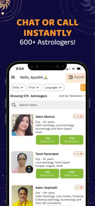
600+ astrologers across specialties, prices, and languages — with no guidance.
Eight modules. Every screen earns one more minute of trust.
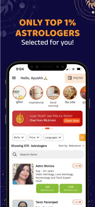
570 astrologers, filtered to the one you trust.
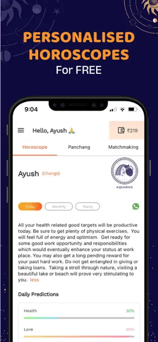
Filters by skill (Vedic, tarot, numerology), price tier, and language. Each card surfaces the three things users scan for — experience years, rating, per-minute price — turning a paralysing 570-person list into a confident choice.
Every number on this page earns one more minute of paid time.
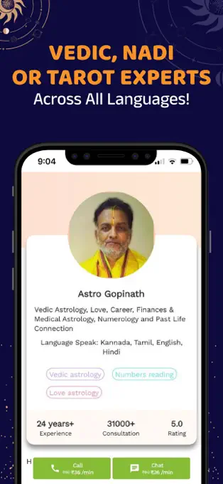
24 years experience. 31,000+ consultations. 5.0 rating. Languages, specialty tags. The profile is a trust page — every element exists to reduce the anxiety of paying a stranger per-minute, with call and chat CTAs always in reach. The deliberate call: consultation count leads over rating. A 5.0 from 10 reviews means nothing; 31,000 consultations is social proof at a scale that's hard to fake.
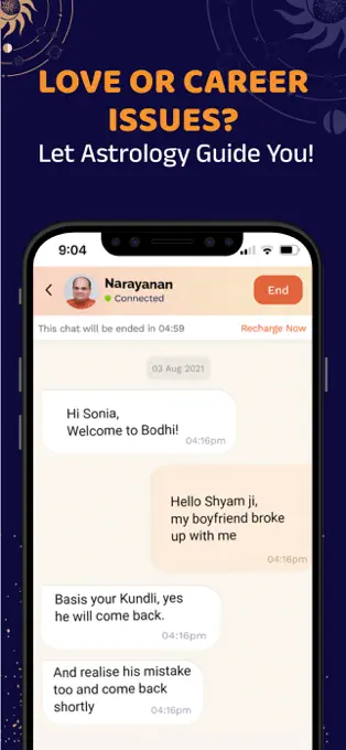
The most personal conversation with a stranger — so the design disappears.
Minimal chrome. The timer is visible but placed at the top, not over the conversation, so it never feels like a taxi meter. Recharge inside the chat so the conversation doesn't break at the worst possible moment, mid-distress. The interface steps back so the astrologer's words feel personal, not mediated by an app.
Horoscopes bring them back daily. Remedies keep them weekly.
This is the retention architecture. Astrology consultations are crisis-driven: bad event → seek guidance → feel better → leave. Without a return mechanism the business dies after the first session. Three layers shipped: free personalised horoscopes (a daily check-in habit), astrologer-prescribed remedies with calendar tracking (multi-day engagement), and services discoverability for reasons to explore beyond the initial crisis.
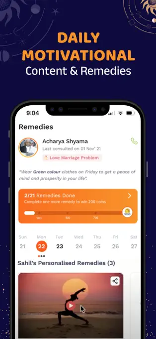
The remedies calendar was the unlock — a one-time consultation becomes a recurring relationship, without notification spam.
Users don't browse astrology — they arrive with a question.
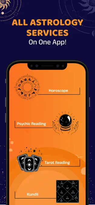
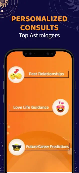
Two entry models: service-type browsing (horoscope, tarot, kundli, psychic reading) for users who know what they want, and problem-based categories (past relationships, career, love life) for users who arrive with a question, not a preference. Some users know they want tarot; others only know they're heartbroken. Both need a front door.
Trust isn't a feature. It's the sum of a hundred small decisions.
The decisions, and what each reveals:
Decision
What it reveals about how Janam thinks
Per-minute pricing visible on every card — not hidden behind a tap.
Respects the user's anxiety about cost. Hiding price creates distrust; showing it upfront converts confidence, not just clicks.
Profile leads with consultation count (31,000+), not just ratings.
In a trust marketplace, volume is proof. Ratings can be gamed; 31,000 consultations is reliability you can't fake.
Chat timer visible but not centred — at the top, not over the conversation.
Balances business needs (time is being consumed) against emotional needs (the conversation shouldn't feel metered).
Remedies calendar with streak-like progress tracking.
Thinks in retention loops, not just features. A one-time consultation becomes a daily reason to return.
Two navigation models — service-type AND problem-based.
Designs for the user's mental model, not the business taxonomy. Some know what service they want; others only know what they're going through.
In-chat recharge so a wallet top-up doesn't break the conversation.
Maps the worst experience — running out of time mid-conversation during distress — and eliminates it at the UX level.
Trust, designed in three layers. Every decision above rolls up into a trust stack: platform trust (top-acceptance messaging, verification badges — category credibility before any individual is chosen), individual trust(experience, consultation count, rating, languages, specialty tags — per-astrologer signals tuned to the user's scan), and experience trust(clean chat, quiet timer, in-chat recharge, a conversation that never breaks). The interface earns the next minute, every minute.
The whole system came from research, not gut — because I wasn't the user, I couldn't shortcut it. That's the discipline the project ran on.
I didn't start as the user. That's why the work holds up.
Four months, eight modules, a marketplace foundation that later served 1.8 million people. I shipped that foundation in 2020 and rolled off well before the growth came — so the claim here is narrow and honest: I'm not the reason for 1.8M downloads. The point is that the architecture survived it. The consultation-count trust signal, the in-chat recharge, the remedies-calendar retention loop all held up structurally as the product scaled roughly 100× past where it was when I left it. Trust UX built from research instead of category convention doesn't break under scale.
Ayush offered a full-time role after the four months. I said no — four months was the right scope. Long enough to design the full product thoughtfully, short enough that my outside perspective stayed an asset rather than going stale. Knowing when to hand off a foundation that works is part of the job.
Designed for believers — by someone who wasn't one. The job was never to share the belief, only to understand the people who did, well enough to earn their trust.