Six years on the product. Two months to give it a brand.
By 2025 I was Head of Design at Leucine, leading the team shipping MES and CLEEN to 60+ pharma enterprises and 370+ plants. The product was deep; the company brand wasn't. As Design & Growth Lead, with two NID graduates, I built Leucine's first complete brand system in two months.
ROLE
Design & Growth Lead
TIMELINE
2 months
TEAM
3 designers (me + 2 NID graduates)
SCOPE
Brand Strategy, Verbal Identity, Visual System
Leucine was founded in 2019 as a pharma cleaning-validation startup. I joined as Day-1 designer in 2020 and spent six years building it into a multi-product platform: CLEEN (cleaning validation, 60+ pharma enterprises, 250+ GMP facilities) and DWI → ePBR → eBMR → MES (51 enterprise customers, 370+ plants, 8,000+ concurrent operators at Cipla). By 2025 I was Head of Design with a five-person team.
The product had matured into regulated SaaS used by Quality Heads, plant operators, and regulators across four continents. The company brand had not — the website, decks, business cards, signage, and merch all ran on a stock-feeling symbol, no defined voice, and whatever colour the deck template defaulted to. Pharma is a trust-driven industry; you cannot ship audit-ready software wrapped in unaudited graphic design.
So in 2025 I took a parallel mandate as Design & Growth Lead and ran a separate brand track. With two NID graduates, I wrote the positioning, set the verbal voice, designed the visual system, codified it into a 56-page brand book, and produced 15+ touchpoints — digital and physical — in two months.
Six years of product depth. Zero documented brand.
CLEEN was selling into Top-5 pharma. MES was running on Cipla shopfloors. Sales was pitching Quality Heads in rooms full of three-letter compliance acronyms. And every outbound surface — deck, email, business card, standee, merch — was designed one-off by whoever was free, against no shared answer to four basic questions: what do we sound like, what colour are we, what type do we set in, and what does “on-brand” even mean. In a regulated buyer's inbox, inconsistency isn't a vibe problem; it's a credibility problem.
Verbal identity
No documented voice
No characteristics, no rules for what we can and cannot say.
Logo system
A symbol in one PNG
No safe space, no placement rules, no misuse cases.
Colour & type
Whatever the template defaulted to
No primary, no secondary, no display face.
Touchpoints
One-off, by whoever was free
Trade shows, cards, signage, merch — designed against no system.
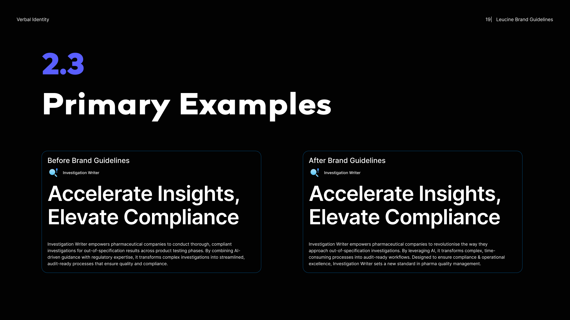
The product had earned a brand. The hardest part wasn't the logo — it was the sentence the logo has to back.
The obvious read was a visual problem: no logo system, no palette, no type — go make assets. That's the symptom. The real gap was that there was no position. A regulated buyer doesn't lose trust because your business cards don't match; they lose it because the company can't say, in one defensible sentence, what it is. Six years of product had earned a point of view that had never been written down. So the work ran in one order — position first, then design — because every visual choice has to fall out of a positioning the brand can defend in a GxP audit, not a mood board.
Audience
Three readers, one brand
Quality Heads, plant operators, regulators — authoritative for procurement, approachable for operators, defensible for audit.
Positioning
Strategic Innovator
Not a disruptor, not an incumbent. Bold but not unrealistic — a position that survives a GxP audit and still prints on a t-shirt.
Tone of voice
Visionary · Confident · Insightful · Approachable
Four characteristics with explicit Dos, Don'ts, and 'can / not' pairs — so anyone can write on-brand without me in the room.
Visual direction
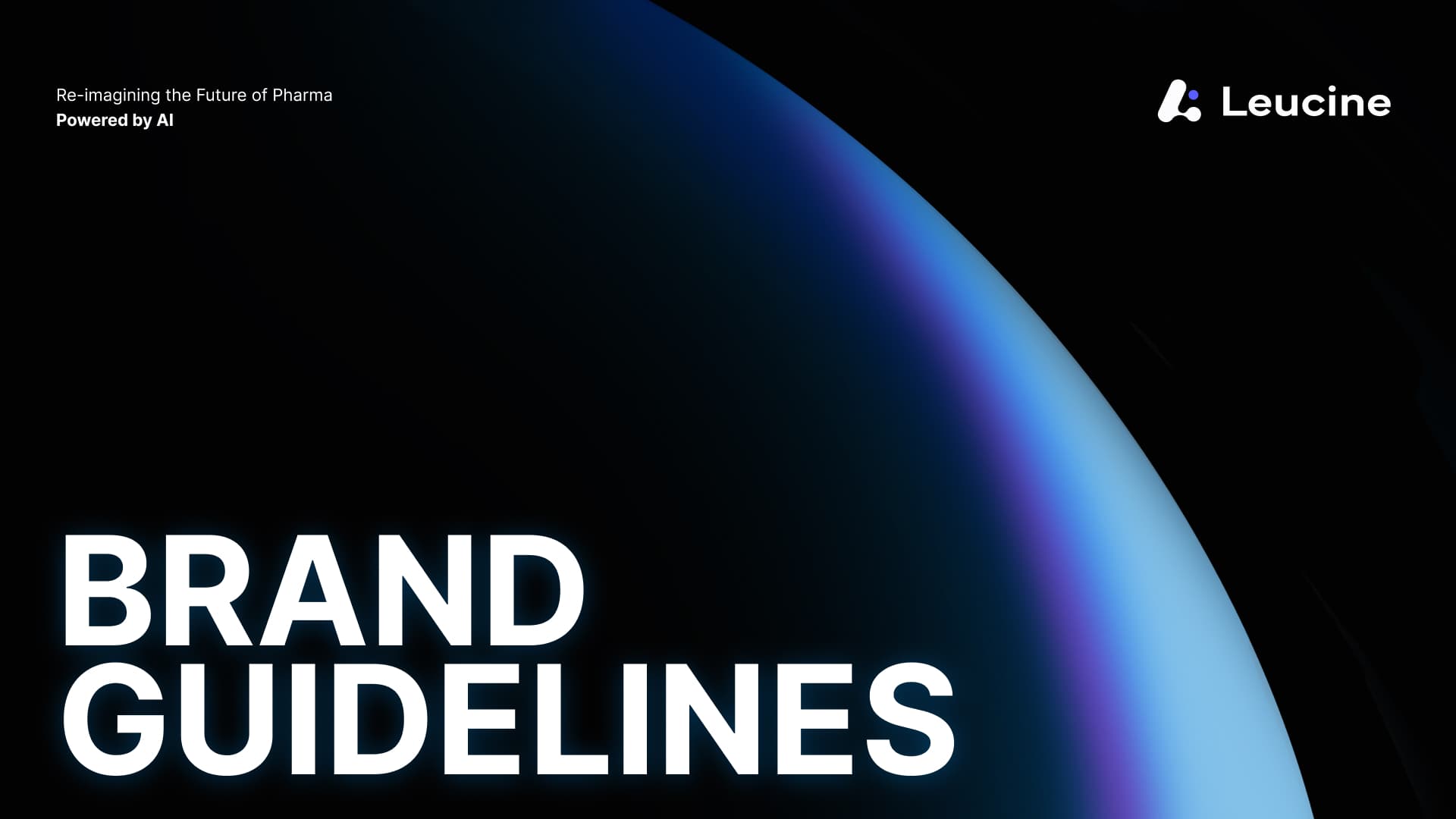
Print-poster on dark
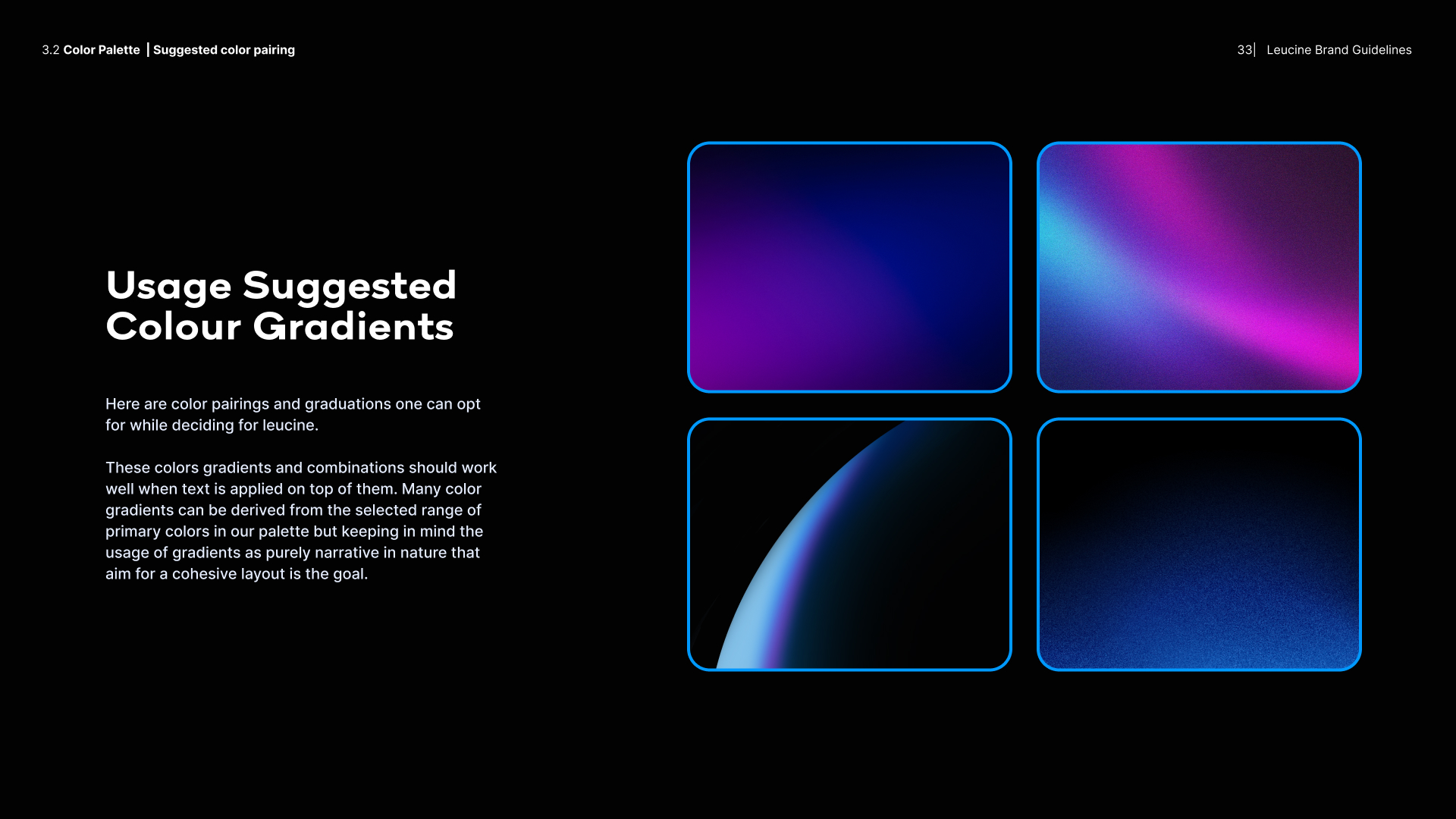
Leucine Blue, deep-space gradients. Inverting the light-mode category canvas is positioning, not decoration — cheap to ship, hard to copy.
Every visual choice from this point had to fall out of that grid. If it didn't, it lost.
One book. Six primitives. Fifteen surfaces.
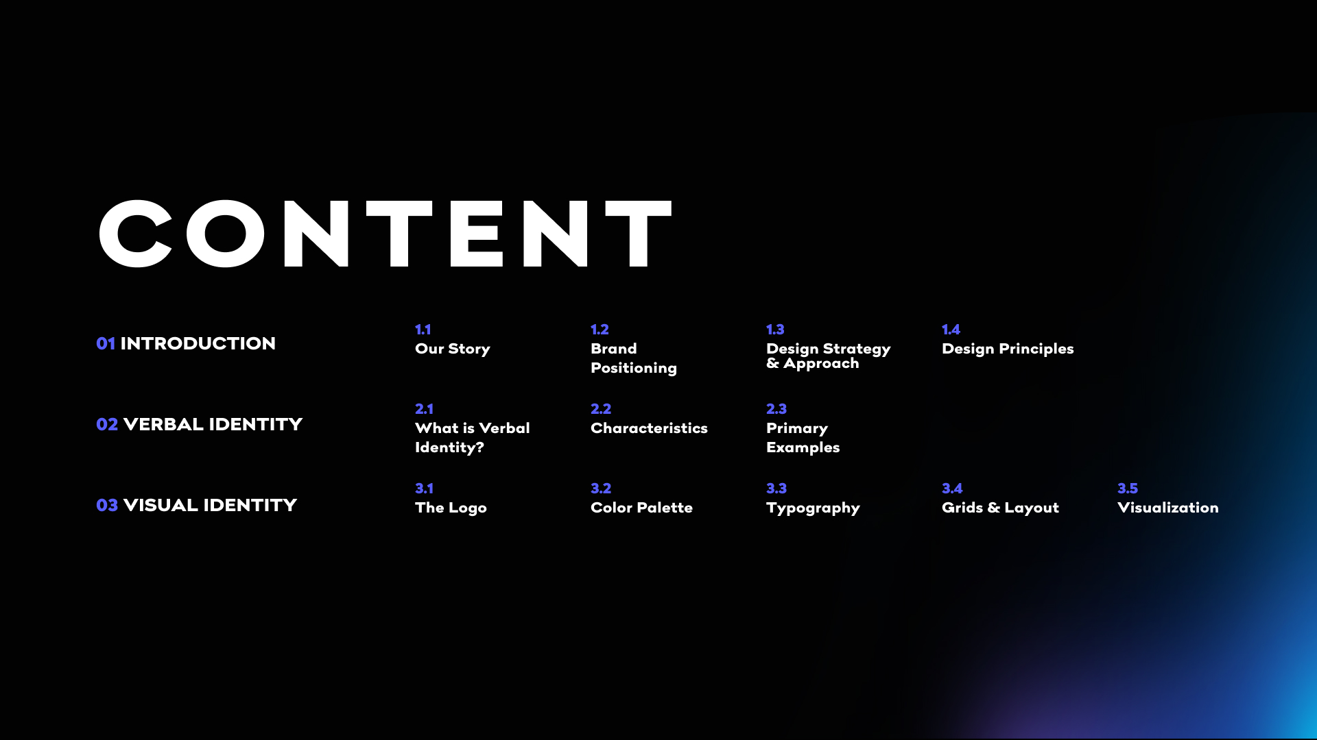
The brand book defines six primitives — Logo, Color, Typography, Voice, Grids, Gradient. Every surface in the wild inherits from those six.
Brand book
56 pages, v1
INNER RING · SIX PRIMITIVES · OUTER RING · PRODUCED SURFACES
A 56-page operating manual the rest of the company can run on.
Three sections, eleven sub-chapters: Introduction (story, positioning, strategy, principles), Verbal Identity (what we sound like and how to write it), and Visual Identity (logo, color, typography, grids, visualization).
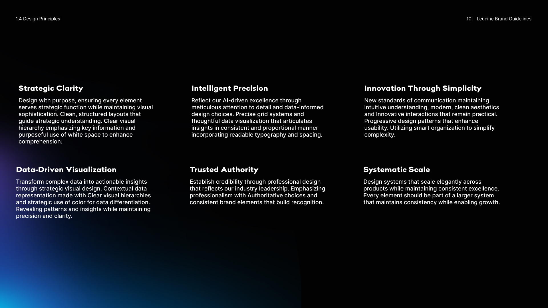
Six design principles, written before any visual was drawn.
Strategic Clarity, Intelligent Precision, Innovation Through Simplicity, Data-Driven Visualization, Trusted Authority, Systematic Scale — one sentence each, on page 10, so every downstream choice (colour, type, grid) traces back to one of six lines.
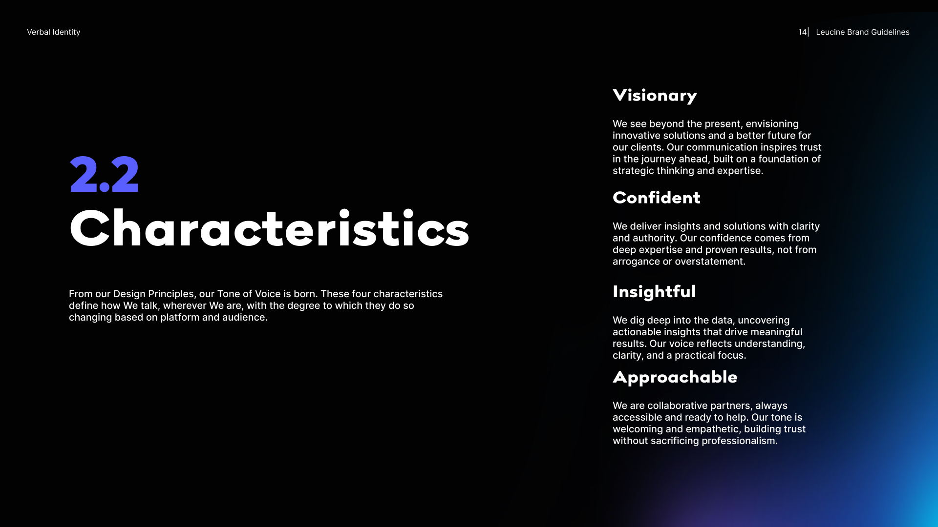
Four characteristics — Dos, Don'ts, and 'can / not' pairs.
Visionary, Confident, Insightful, Approachable. Each gets a full page with three Dos, three Don'ts, and three “we can be X but not Y” pairs — executable rules, not vibes. The load-bearing artefact is the can/not pair: bold but not unrealistic; authoritative but not rigid; intelligent but not inaccessible; clear but not simplistic.
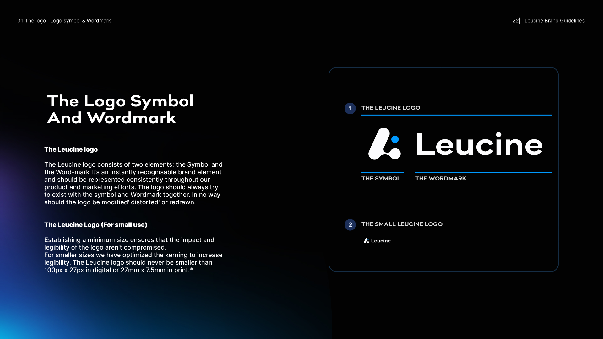
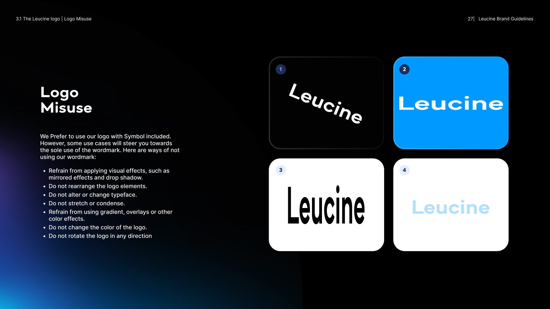
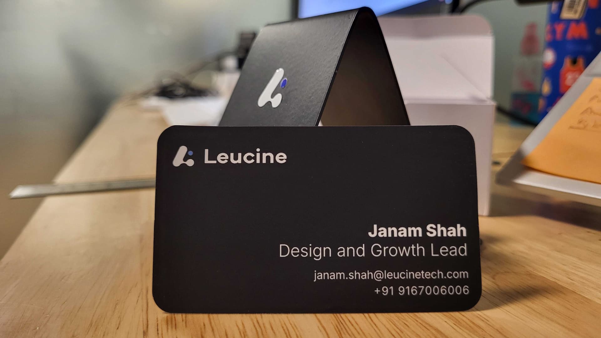
Logo system — safe space, placement, and misuse codified.
Two elements, one mark: the Symbol (an L-shaped form whose negative space holds two amino-acid dots, drawn from the leucine molecule) and a Pieta-derived custom Wordmark. Safe space is built off the lowercase uof the wordmark — a unit of measurement, not a vibe. Seven explicit don'ts, drawn the same week as the logo: rules and artefact ship together, not in two phases.
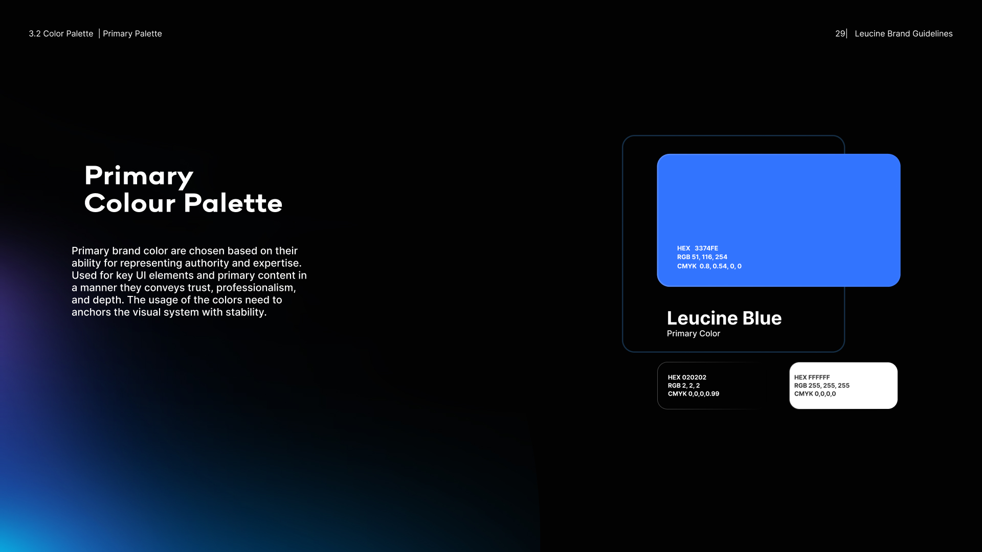
Color — Leucine Blue (#3374FE) anchors; everything else is derived.
One primary (Leucine Blue), two anchors (black, white), and a six-cell secondary palette used as accents, with explicit pairings to use and to avoid. Narrow on purpose: a twelve-colour system signals stock template; three-plus-six signals discipline. The gradient set is the brand's signature — deep-space derivations that do positioning work a stock-photo background can't.
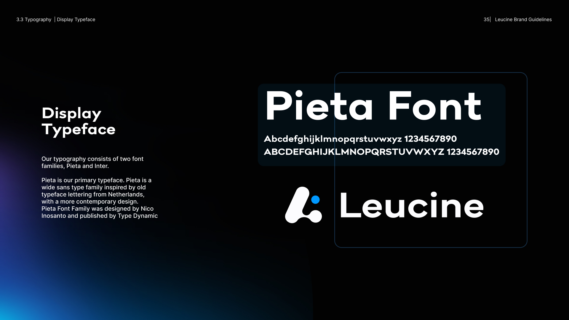
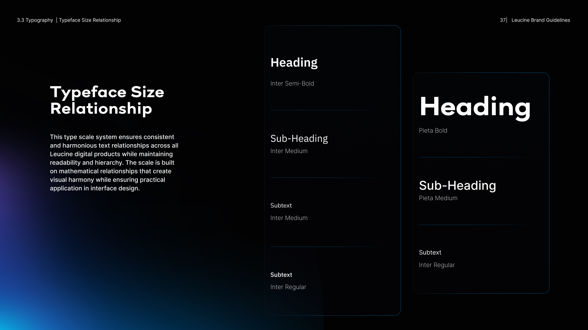
Typography — Pieta for display, Inter for body. One scale, print to screen.
Pieta (display) is a wide Dutch-lineage sans — it sets up positioning the moment a viewer reads a headline, not the geometric sans every pharma SaaS uses. Inter (body) handles every screen-rendered paragraph, tabular number, and form field. Both free, both legible at 11px on an industrial tablet. One Heading / Sub-heading / Subtext scale shared across digital and print, plus a 12 / 8 / 6 column grid.
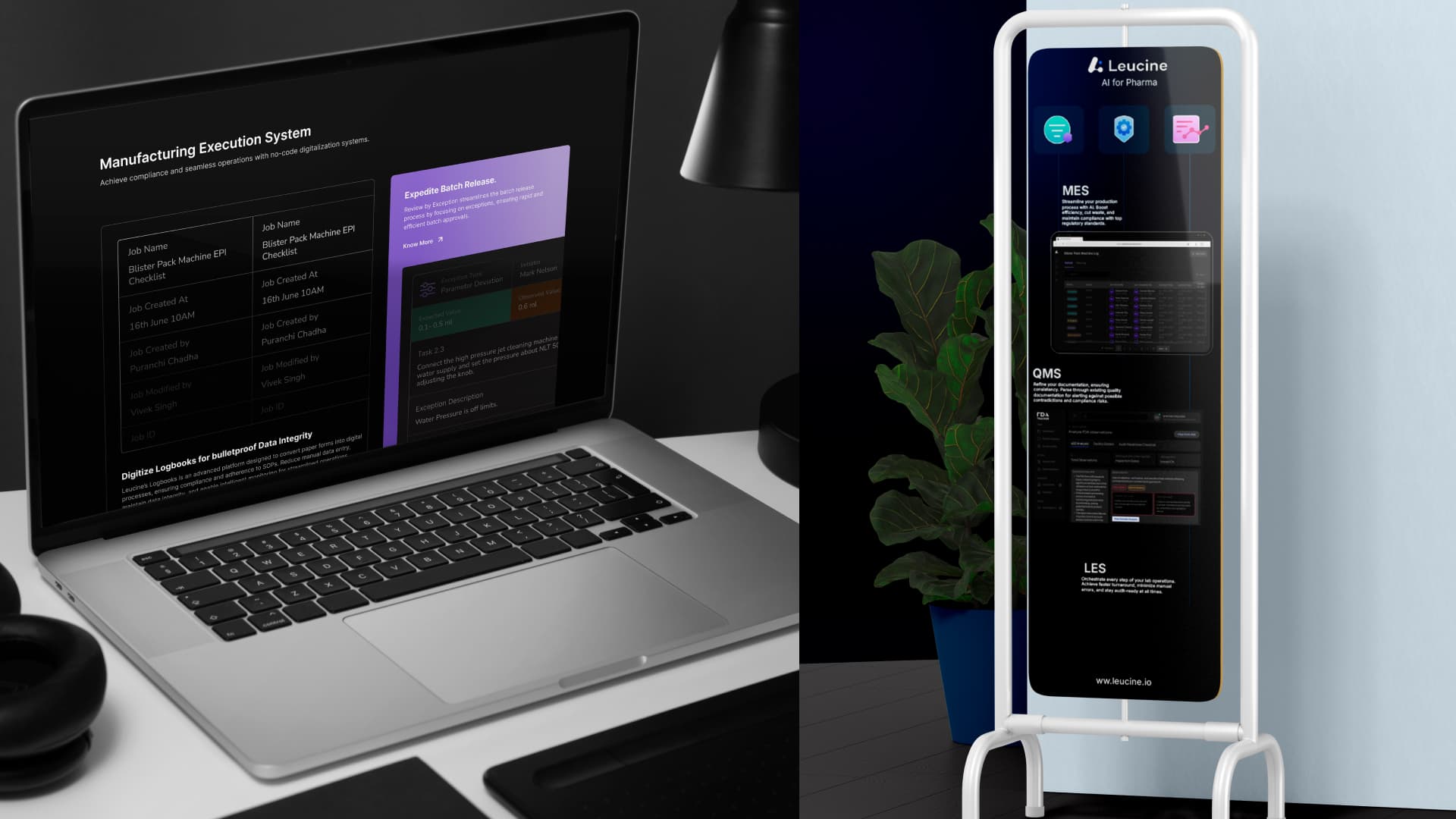
15+ surfaces produced under the system.
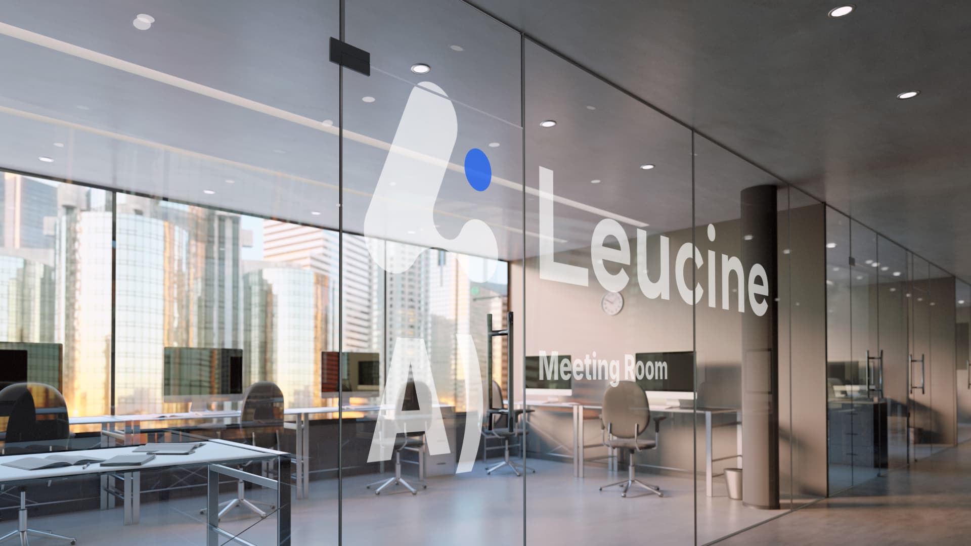
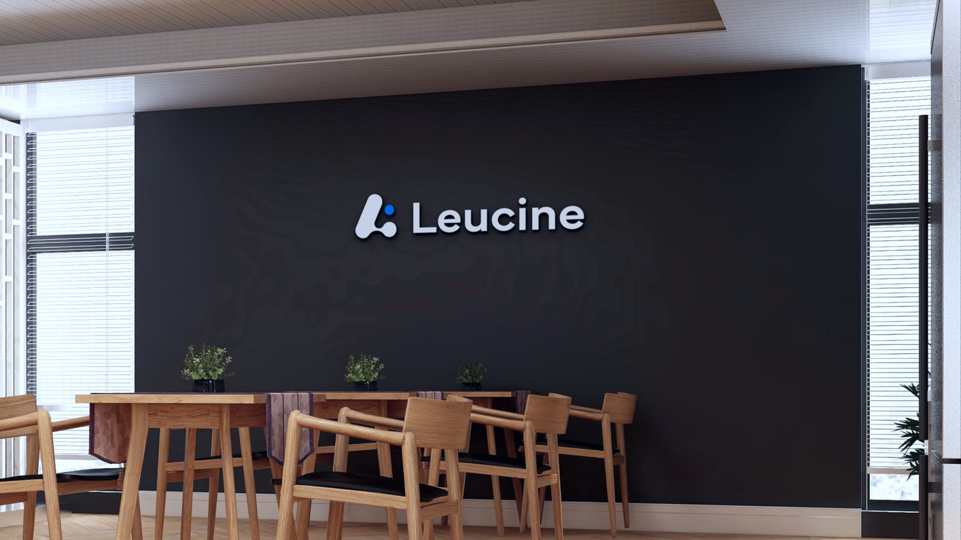
Once the rules existed: office wall signage, glass meeting-room branding, outdoor facade signage, trade-show standees, NFC/QR business cards, ID badges and lanyards, letterhead, internship offer letters, merch, stickers — and the brand applied at product surface (MES screens beside a standee), so the system reaches the artefacts the customer actually buys.
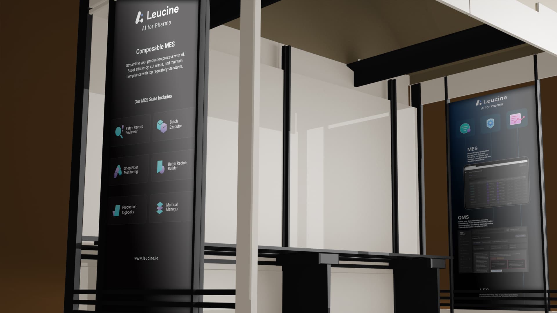
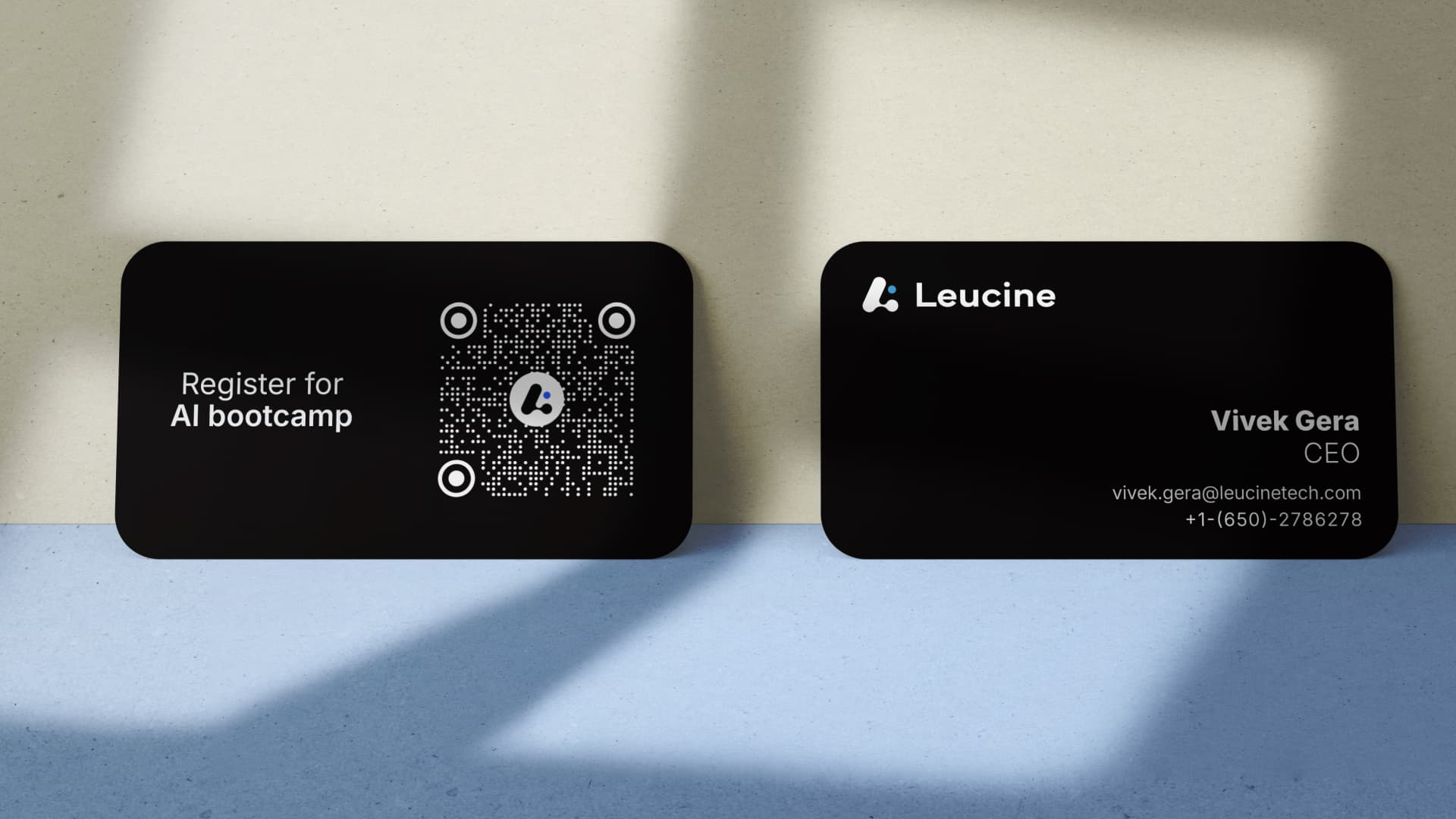

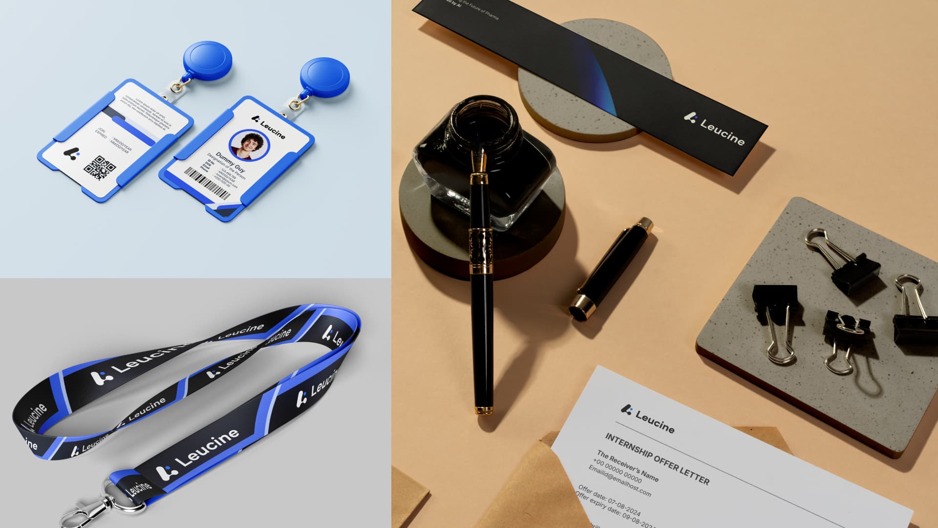
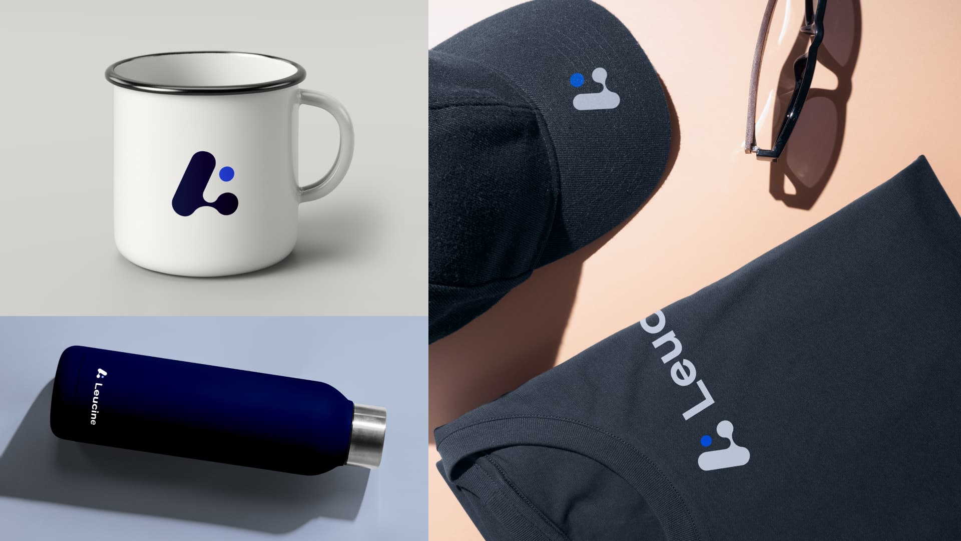
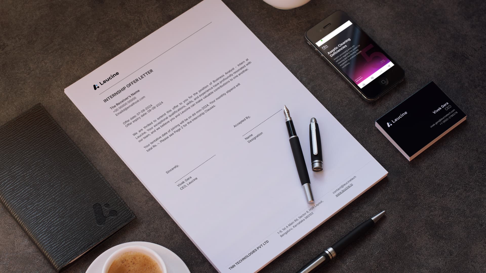
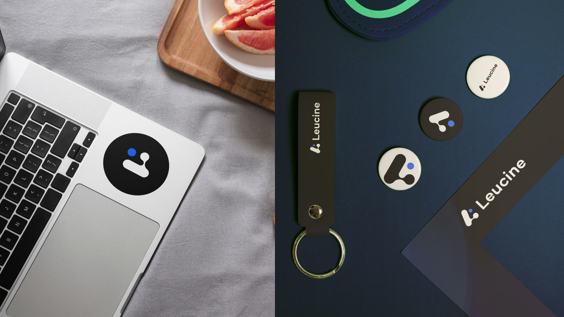
TOUCHPOINTS · SIGNAGE · STATIONERY · MERCH · TRADE BOOTHS · PRODUCT SURFACE
Eight calls. Each one tells you how I think.
Decision
What it reveals about how Janam thinks
Wrote the positioning ('Strategic Innovator') before drawing a single visual.
Treats positioning as a design decision. The visual system isn't the brand; the words it has to back are.
Codified four characteristics with Dos, Don'ts, and 'can / not' pairs.
Writes rules sales, marketing, and support can execute without him in the room. Brand systems should outlast their author.
Picked Pieta (a wide Dutch-lineage sans) and tested it on a 10-inch industrial tablet and a 60-page audit PDF before signing off.
Type choice is positioning, and positioning has to survive the worst surface it'll appear on. Picks for the gloves-and-PPE shopfloor first, the keynote last.
Anchored the system on Leucine Blue (#3374FE) and derived everything else.
Designs systems that compound. One primary, one secondary set, derived gradients — not a swatch library.
Inverted the canvas — dark + deep-space gradients where pharma SaaS lives in light mode.
Uses surface-level visual choices to do brand-level positioning work. Cheap to ship, hard to copy.
Drew safe-space, placement, and misuse rules the same week as the logo.
Ships systems, not assets. Rules and the artefact are one deliverable, not two phases.
Produced 15+ touchpoints alongside the brand book, not after it.
Ships across digital and physical as part of the launch. Brand books that arrive as a PDF on a shared drive die; ones that arrive with a mug, a standee, and a card stay alive.
Stayed out of MES and CLEEN product UI in this work.
Draws scope lines explicitly. Product UI is a separate multi-year effort with a separate team. Honest scope is a hiring signal.
Why position before palette.Auditors and Quality Heads don't buy from companies that promise revolution — they buy from companies that promise compliance with intelligence layered on top. “Strategic Innovator” is a position you can defend in a GxP audit and still print on a t-shirt; “Disruptor” isn't. The hardest part of a brand identity is the sentence the visual has to back, and that sentence has to survive procurement, not just a Dribbble shot.
Why the surfaces, not just the book. A brand book that ships only as a PDF dies on a shared drive. I produced the surfaces in parallel with writing the rules, and the launch went out withthem. When the team sees the system actually applied, they trust it; when they only see a PDF, they make their own version.
A brand book is only as credible as the surfaces it survives on.
The same system shows up on the glass walls of the office, on the standees walking the trade-show floor, on my own business card, on internal letterhead, and at product surface inside MES and CLEEN. None were one-off agency jobs — every surface traces back to a page in the brand book. That traceability is what turns a deck of mockups into an operating system.
Scope, stated plainly.What I'm claiming is the brand system: positioning, verbal voice, logo, color, typography, grids, and the 15+ touchpoints — designed and shipped with two NID graduates I led. The MES and CLEEN product UI is a separate, multi-year effort with a five-person product team I also led, covered in those case studies. Showing those screens here is evidence the brand reaches product surfaces, not a claim that I redesigned them under the brand mandate.
Six years of product earned the right to a brand. I wrote the positioning, drew the system, and shipped the surfaces — in 60 days, in parallel to leading the team that ships MES and CLEEN.
Three lessons for the next brand book:ship a tokens file alongside the PDF (a 56-page book is durable; a CSS / Figma variables export is operational); write the social templates inside the book (verbal characteristics × content type × channel, so it pre-empts the follow-up); and date the rules (version + date per chapter saves a quarter of “is this still the rule?” in year two).